03/11/2010

Conventions of the Thriller in 'Once Upon a Time in America'

Once Upon a Time in America is a powerful American gangster story from the great Sergio Leone, whose roster of films includes the spaghetti westerns featuring Clint Eastwood (the music of which is intertextually referenced in Kill Bill: vol.2). The film in question stars Robert De Niro as Jewish prohibition era bootlegger David ‘Noodles’ Aaronson, once member of a notorious gang along with his childhood friends. In the film we see Noodles’ childhood, his rise to and holding of power in Brooklyn and eventual return in order to face the demons which continue to haunt him.
In the opening scene, Noodles’ apparent girlfriend emerges from the darkness -a darkness seen frequently in the murky light-lacking back alleys of Thrillers- she moves in suspenseful silence toward the bed. She unveils the first defining image of the film, a silhouette of bullet holes, connoting both the violent gang culture of the time and the displacement of Noodles from where he is expected to be. The corrupt and/or incompetent law officials we have learned to expect then arrive, and initiate the indiscriminating violence upon the girl. The willingness to kill and lack of concern for the human life makes us assume the cops share a collective psychopathy. The next scene is ushered in with yet more violence, at levels not normally seen in our naive scope of society, yet in Thrillers this amount of violence is archetypal.   

Conventions of the Thriller in 'Essex Boys'

Essex boys is an archetypal British gang movie released in 2000, based on true events revolving around the death of three drug dealers 5 years prior. The opening scenes begin with a narration from key character Billy (Charlie Creed-Miles) as he prepares to drive psychopathic Essex drug dealer Jason Locke (Sean Bean) to his next victim.

The opening is littered with aspects of the Thriller from the first few seconds. Though the setting may be far closer to home, it still shares conventions with other international Thrillers.

As the titles roll, sinister lines scrape across a black backdrop. These lines appear similar to keying the side of a car, suggesting teenage delinquency. The straight hatching of the strokes also hint imprisonment; brushes with the law are always present in Thrillers. Once the opening credits are done, the narration begins in a hardened Essex twang, associated often with exaggerated brutality in the news - that and Thatcher’s loyal cronies in years passed. The garage doors open into a decrepit hovel of cobwebs and rust, decay of every aspect of life. As Billy wipes the dirt from his van windows, Jason appears through the half-cleaned glass. The filth in which he becomes visible through mirrors his social status and pure lack of morals. The image of the white van is also an ominous and frequent one in the Thriller genre, hinting imminent danger and/or abduction. The abduction comes quickly along with generically raw acts of violence. The seedy activities of violent gangster types culminate at the victim’s dumping on the Essex marshes; the landscape is bleak, dead and featureless, a staple location of Thrillers. Jason’s hapless victim is hurled from the van, still blinded by bombardment by chemicals in the first of many gripping activities; the abandonment and sheer hopelessness of Jason and the roped in Billy’s victim can be found in other Thrillers, following a bleak and unavoidable incident. The character of Billy plays the core role of a fairly innocent young man drawn into the seedy gang culture, who suffers a huge emotional strain for his mistake.

01/11/2010

Conventions of the Thriller in The Third Man

 Often regarded as one of the best films ever made, the 1949 classic The Third Man is a perfect example of early film noir. Joseph Cotton stars as Holly Martins, a failing pulp writer called to war-torn Vienna with a job offer by his friend Harry Lime (played by Orson Welles). After Holly arrives, it comes to light that Harry has apparently been killed in a car crash. As he interrogates the witnesses, holes in the story of how (and if) Harry was ran down begin to surface, and Holly starts to suspect that all is not as it seems. With the reluctant help of Harry’s lover, Anna (Alida Valli), Holly delves into the darkest corners of Vienna in a quest to find the truth. Welles’ performance as Harry Lime, much like his various other cinematic appearances, is extremely mem
orable and well-orchestrated. The film won the Grand Prize of the 1949 Cannes Film Festival, the 1950 BAFTA Film award for best British film and the 1951 Oscar for best cinematography in the Black & White category.
The Third Man is a prime example of film noir, and contains various shots displaying conventional characteristics of thrillers, this including the mystery-driven plot. As the film opens to the Third Man Theme on zither, as the initial voiceover from Major Calloway (Trevor Howard) describes the divided city, the seedy goings on about Vienna become clear. A flourishing post-war black market is hinted visually by the iconic image of the selection of watches; illegal and underground activity is at the centre of countless plots in thrillers. The expected plain and unforgiving view of death and violence is also glimpsed from the get-go; a body drifts in the tide beside the river Wien, signifying the dilapidated state of the city.
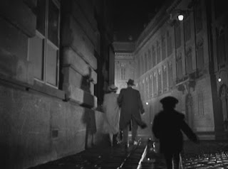
Apart from content, the shots in the film also subtly connote stereotypical assets of thrillers. The use of angles in Martins and Holloway’s conversation are very effective. The canted angle and over-shoulder pieces clearly show a conversation is taking place, confusion mounting in Holly’s mind. Holly is seen at a low angle to the man on the staircase when he arrives at Harry’s apartment, as he has no grasp of his surroundings or his peers’ languages; he is a stranger in a strange land. Shadows are utilised throughout the film; Harry is presented as if he is the Yang to Holly’s Ying. Shadows and silhouettes appear to follow Holly, constantly watching his investigation. Black comedy is also included in the ever-so-slightly menacing little boy as he chases Anna and Holly through the streets. The most famous sequence is that of the
sewer scene. The city appears to be a maze, Harry darting in and out of crevices like a cornered rodent. The rule of thirds is applied to focus our attention on Harry’s futile attempts to escape, and Chiaroscuro lighting bathes the waterways.

31/10/2010

Conventions of the Thriller in 'Kill Bill: Vol.2'

Kill Bill: Vol.2 is renowned cult movie director Quentin Tarantino’s sequel to the insanely over-the-top and highly influential revenge story Kill Bill: Vol.1. At the end of the first film, Uma Thurman as the wronged and rampaging assassin known only as The Bride has narrowed her ‘to kill’ list down after facing off with Lucy Liu, and is swiftly progressing to her primary target, ex-boss Bill (played by David Carradine), but her nemeses will do everything in their power to delay their inevitable reduction to literal blood fountains. And this time The Bride’s daughter is thrown into the mix. Incorporating an intricate set of revealing flashbacks, brutal fight scenes, unforgettable dialogue and intertextual nods to Tarantino’s admired directors, both films have a pride in place on the wall of great Thrillers, with a huge cult following to boot. The sequel bagged two Golden Globe nominations; one for best actress and the other for best supporting role.
The scene analysed in our media course was that of The Bride’s attempt at killing Budd, Bill’s less than desirable redneck brother. But Budd is wittier than we are led to believe, waiting for The Bride’s path of espionage and slaughter to come to his dirt-ridden trailer. The scene inevitably ends in our heroine’s incarceration.
As the scene begins, Budd rolls into view in his rusty old car to the camera. Straight away we as the consumers see the conventions of a Thriller bleed through; a barren and featureless landscape, one where we can be watched from all angles by evil eyes; next, an unsettling image of the car headlights nearing us, applying a sort of morbid anticipation for the danger ahead. The shape comes out from the darkness like some demonic spectre in search of prey; the light and dark chiaroscuro tones also apply, plus the gunk and erosion about the car hint toward the moral decay of such low places in society. As Budd starts to suspect company, he retreats into the trailer -itself a symbol of his ‘loser’ status and seedy activities, ever present in Thrillers- allowing the Bride to rise up from the low and claustrophobic spot where she has hidden. As she prepares to have a stab at Budd, he looks out of his blinds onto the savanna, projecting a cold and artificial light in prison-like bars. He switches on a tape of the Johnny Cash song ‘I Don’t Hurt Anymore’ (oh, the irony!) and waits, shotgun cocked, for The Bride to storm in. Gun beats sword, quite blatantly. What follows is a carefully selected set of dialogue shots to place Uma’s character at a lower level of power, at the mercy of the film’s loser, and difficult spots like these crop up again and again during a Thriller’s run time.


Conventions of the Thriller in 'Witness'

Directed by peter Weir in 1985, Witness is a modern thriller telling the story of an Amish boy (a young Lukas Haas as Samuel) who witnesses a murder. Harrison Ford plays John Book, the cop tasked with protecting Samuel until the trial, who must swiftly go into hiding in the Amish community; else he and Samuel could meet the same fate at the hands of the corrupt figureheads of the police force who committed the crime. The film is revered as one of Ford’s best performances, and is a notable part of the Thriller genre. The film went on to win the Oscar for best editing and best writing.

The particular scene analysed in class was that of the murder witnessed by Samuel, committed by Danny Glover’s character James McFee. It contains many generic conventions of the Thriller.


First of all, the scene in question takes place at 30th street station, Philadelphia, an iconic symbol of the bustling city life and a setting used in many other movies. A man in the bustling crowd exposes a tattoo on his hand, connoting a form of hidden corruption in the city amongst the high rise buildings and hordes of passersby. Samuel approaches a Jewish man believing that he is Amish, and backs up in disdain when he realises he is mistaken. The multiculturalism of the city is happily present, and the crowded city is a prime setting for s Thriller. When Samuel enters the lavatories, you see another convention of Thriller setting; the seedy nooks and crannies of the city. The toilets are ran down and vandalised, and not a very comfortable place to be in. Suspicious characters line the walls, ready to attack unsuspecting victims and provoke a sense of shock from the audience. When Samuel enters the toilet cubicle, the completely generic presence of claustrophobic spaces arises. All of these factors begin to build tension, until the murder is committed. Thrillers are typically littered with excessive yet believable acts of violence, this scene included. The culprits are also members of the police, as Thrillers tend to contain seemingly innocent villains. As McFee opens the cubicles, we fear for Samuel’s life, the cinematography highlighting his fearful gaze. Another generic point, the hero is presented with impending pain or death, yet manages to escape narrowly at the last minute.


30/10/2010

Definition: Femme Fatale

Femme Fatale, French for deadly woman, is the term generally used to describe one of the archetypal female characters in Thriller and Film Noir movies, like the character of Anna in The Third Man. Femme Fatales tend to lure in men with their beauty and seduction, and into a gruesome demise, or danger. They tend never to show affection for the protagonist, and draw him into often fatal situations by driving him to obsession and irrationality.

Definition: Film Noir

Coined by French critics studying monochrome detective and thriller movies in the 1940s, film noir is characterised as being menacing, pessimistic, fatalistic, cynical and sexually driven. The films are stereotypically black and white, and the characters are desperate cynics. Murders and corrupt police activity are a staple in the key lit urban setting.

Analysis and Evaluation of Cosmetics Advertisement

This is the finished advertisement for the Cosmetics Unit of Media Studies, for the fragrance 'Wild'. In this unit students were asked to create their own advertisement for a fictional product using photo editing software and self-made pictures.
 
The original product was branded as 'Wilt', but was deemed possibly unappealing to the consumer. The name was switched to 'Wild' so as not to complicate the editing of the logo or lose the desired connotations of the product. I somewhat prefer the original logo due to how neatly it has been edited into the frame, but the altered version has a less distracting, more natural colouration to the mountainous backdrop.

Construction
  The shot I used was taken during a family holiday to Canada, on a deserted shoreline. I chose a spot not littered with dying jellyfish and captured a wilted piece of flora in the frame. After superimposing the model, the image becomes a long shot. The image itself is landscape and quite large; mountains and weather formations fade into the distance, at which point the water rests in a straight line. The rocky landscape across the body of water and the soggy sediment on the beach frame the action in the foreground. The angle is partially out to the left, the beach moving upward to the edge of the frame, where the figure has been placed. The background is moves out of focus gradually with distance, with the most crisp and clear object being the dandelion.
  Due to the open space of the shot location and lack of interference by industry in the area, the lighting is primarily natural. The light filters through the clouds on the horizon, lighting up the whole image with a mild glow. The fully natural yet partially obscured light mirrors the wilderness itself, untouched by humanity, but blocked out by his tall, clinical structures.
  The mise-en-scene has been constructed by adding small images to the photograph and changing brightness and saturation accordingly. The dandelion has been carefully desaturated, leaving it completely drained of life. The mountains are unaltered, save a slight correction on lighting to bring up the shapes. The connotations here are that nature is still separated from mankind, yet is slowly retreating to an early grave because of our interference. The figure is desaturated and placed as if walking along the beach; the figure is in touch with nature and their own natural beauty by using this product.
  The rule of thirds has been used to draw the eye to the figure, but the entire picture is designed to lead consumers through the desired spots. The figure is at the far left, followed by the logo and plant, then the product itself. This layout guides the consumer to the important product placements, but also follows the natural gradient of the beach. No cropping was used in the image, symbolising the detachment from human interference. The chosen name greatly reinforces the inclusion of nature in the product: the logo is framed by the dandelion, and is blurred as if standing out on the shoreline. The consumer of this product will feel natural and unhinged.
  The narrative of the advertisement is simple - a lone figure straddles the gloomy shoreline, looking for a way to escape city life. They look outward across the beach and water, and are moving in a walking motion along the driest walkway of the beach.
  The model is in a padded leather jacket and pair of loosely fitted jeans. They are very much protected from the wind and cold, yet still appear calm and casual in attire. No make-up was used in fear of straying from the initial purpose of highlighting natural beauty. The facial expression is calm and cool, the stresses of city life lifting from their shoulders, though it has been blurred greatly to fit in the distance. The model is in deep thought whilst looking out into the water, contemplating what he really wants from life. The hair may connote a rocker attitude or social group, but the blur on the figure lets the gender become undetermined. This product could appeal to both women and men, but a male audience would recieve the model far more positively. The figure may be too far away for sexual appeal or relation to one's self, but this distance serves to build upon the escapism of nature.
  As social groups go, a hard-working and industrial 'city folk' can be targeted as the product offers solace in nature. The model's denim and leather look may appeal to the teenage desire to be non-conformist. The bleakness of the background is contrastingly mature, and the age group can be widened by this, stretching from mid 20s to possibly early 30s.

Technologies
  The spontaneity of photography on a holiday only left a simple digital camera for use, but the limitations worked to my advantage. The camera solely focused on the dandelion, but there was originally no intention of using the photograph in work. Adobe Photoshop Elements was used in school to experiment with features and begin to edit in the bottle and figure, but Serif Photo Plus X2 was favoured due to its availability at home and past success with editing of text.
  The availability of editing software, blogging and cameras over the past few years has allowed the public to engage in the media with ease. Images and texts can now be published onto the Internet for all to see quickly and easily, when only decades before such a thing could only be accomplished from inside a major media institution. Our perception of texts has been changed dramatically, as we can now comment on, object to and add to (or even create) texts ourselves.

Target Audience
My target audience is the modern teenager and young adult, primarily situated in big cities. Our generation is extremely self-conscious. Young people become doubtful of their own image with the media displaying so many chiseled Action Man abs on bald bodies and backbreakingly large bosoms weighing paper-thin models down. Natural beauty should be something that is celebrated in society. My advertisement should ideally be shown in a public place such as a shopping mall, far from the nature it depicts.

29/10/2010

Photoshop practice/preliminary test

For my quick practice on manipulating images prior to a cosmetics ad, I foundk an easily manipulatable backdrop in the red fabric and a central object, the skull. Through a ceries of layer applications, warping and fine details my end result is a satisfyingly macabre, monochrome vortex.

The consumer may be unsettled by such an image, or if longing for a more noir approach will be satisfied with the implication of encroaching death. On a whole I am pleased with how the image turned out, and can possibly encorporate similar techniques into the final advertisement.

28/10/2010

image cropping/anchor test

The original image is a simple snapshot of life on a street in Bruges, Belgium. People are on their way to work and other destinations, crossing the road and taking a sit down to rest their legs. A lot appears to be going on, yet nothing particularly exciting or tragic has occurred.

Cropping an image can change its connotations entirely. Meanings of certain extractions can be billed as motivation pieces, news headlines or even propaganda.


 Image 1 could be a group awaiting some important occurrence. All other activity has been cropped away to leave the group, who seem to be awaiting something; whether or not what they await will benefit them can be questioned. Image 2 connotes mass travel; an exodus, traffic jam, evacuation or rush to enjoy the holiday while it lasts? Image 3 is of the two people crossing the road, but now that their destination is nowhere to be seen, they can appear lost, or part of the bigger group infront, their intentions unknown.

Image 4 is merely the skyline. Architecture can be labelled here, as well as the high rise nature of the buildings. Pollution, overpopulation, disrepair, poverty and a sense of the past seem to come through on this particular crop.

Finally image 5, an image with little to no excitement. The whereabouts is now unknown, but the people revert to their original purposes. The hustle and bustle of city life is focused on in its entirety.

Examples of lighting in three images

 1: Back lighting

This photograph of a lone tree is back lit by the natural light of our Sun. Back lighting is frequently used to connote holiness or great importance. This is true for the image in question, as it is the only standing landmark. The light coupled with the loneliness of the tree places it at centre stage in our line of sight, and what a beautiful sight it is to behold. The tree rises from the horizon like some great glowing monolith, giving hope, salvation, or on a bleaker note some form of death and/or capture as its all-encompassing shadow stretches across the faceless ground.

2: Key Lighting

Key Lighting the first and most important unnatural light source used in media, used to focus solely on an object and highlight its features or dimensions. The shadows created can contribute to a sense of mystery, or connote baleful anticipation. Used alone a key lit shot can offer chiaroscuro to a scene, which is especially important in a Thriller in its subtle application of light and dark, good and evil. 

3: Natural Lighting

Natural lighting, if nothing else, applies a realism to the shot. The consumer is urged to believe that it is in the day, and not artificial. An absense of well-coloured natural light can connote a sense of unreality, as seen in the incredibly green Matrix Trilogy. The wide and featureless open spaces of Thrillers are often naturally lit, if a little lacking in colour during Winter.

10/10/2010

Advert analysis II

This advertisement is for the Giorgio Armani fragrance ‘armani code’ distributed on the web – note the ‘learn more’ hyperlink in the bottom right-hand corner and shape unconventional in magazines. It features a confident looking and smartly dressed young man in intimate contact with whom we assume is his lover. The woman has been seduced by the fragrance, following the trend of other perfume advertisements by morbidly exaggerating any effect it may have on attracting women. The formal attire and monochrome design place the scene in the past, and build upon the air of seduction in the image. The product is aimed predominantly at a male audience, representing the woman as some object of male desire ensnared by the product; this nauseatingly sexist portrayal of women is all too present in the fragrance business. The slogan, ‘the ultimate code of seduction’ leads the consumer to believe that they can meet those of the opposite sex by purchasing the product; 'ultimate' places it on the no.1 spot in possible attractive scents. Yet the depicted male’s attention is elsewhere, as if uninterested by his lover, once again presenting a held dear by clusters of idiotic men. The advertisement is presented in 100% monochrome, mirroring noir film's dark and mysterious flair. The male could almost be the typical hard-boiled character of cinemas' past. You are instantly attracted to the figures as familiar objects, with use of the rule of thirds. The direction of the male's attention is toward the logo and product, be it non diagetic. The chiaroscuro lighting furthers the mystery and stays loosely in the noir sector of advertising.
This Dior advertisement I found particularly eye-catching. On first glance you see a beautiful young lady studying herself in the mirror, possibly readying herself to go out. She has cosmetic products lined up for her use, so as to impress her partner - or even a stranger or acquaintance. Looking closer you see the grim visage of the human skull (or, if like myself you take more of an interest in the noir and macabre, you may have noticed the skull first). The placement of the skeletal face subtly into images is a niche art form dating back hundreds of years; the power of suggestion has a profound effect on the mind. The context of this may also hint to hallucination; the girl may be a femme fatale of sorts, luring the gullible man to his doom. Whether or not this perception of the advertisement is true, the title of the product is linked in an almost primal sense to death and illness, hence the skull. The positioning of the camera suggests the entering of the room, where the woman waits; for courtship, to seduce, to be spied upon, or simply running late for a show, her motives are in mature territory. The light eminates from the 'skull' and out into the black, attracting us only to the center. The logo is in eye-catching red, like the blood of a poisoned victim flowing through the body and spreading death. It is instantly noticable in the shadows of the stacking luggage.

21/09/2010

Movie poster Mise-en-scene decription, 1st try


The poster is a concept design/redux recently drawn by Olly Moss for Sam Raimi’s cult horror ‘The Evil Dead’. It depicts the now horror cliche log-cabin-in-a-forest setting on an aged sepia paper, where protagonist Ash is burying a corpse. The image is also in the shape of an undead hand bursting out of the ink smudge-like soil, hinting to the loosely strung together zombies-in-a-cabin plot of the movie, and ‘shot’ on a dramatic angle. The hand design is red in colour, suggesting the evening, and on other levels a bloody hand print. The fingers are solidified by background trees. The contrasting colours are extremely eyecatching, and the choice of colours (black, white, almost sepia) seem to be a nod to classic horror posters from decades before.

Is the film industry hit-driven?

  The film industry can appear a brutal area of profession. A swansong of a movie which a director/producer pours their heart and soul into can be obliterated and tossed aside at the box office by a huge blockbuster movie raking in more for the opening week than the director’s well worked masterpiece could do in its entire existence. Indie and niche films, no matter how flawless they are, can often be overlooked by the majority audience, who opt instead for an embarrassingly awful reboot of an already well-milked franchise. Veteran of the industry Eric Fellner suggested that “The film industry is a hit-driven industry”, which may very well be true.
  It doesn’t take an eye well-trained in the ways of film to see that the real money-rakers in the business are more often than not the heavyweight companies. The now highest grossing film of all time, Avatar, made nigh on $1bn at the box office-a number unimaginable by any amateur film maker -but a key reason for its success was the man at the helm, James Cameron. A virtual godfather of film and the man who gave us Alien, Terminator 2 and Titanic, Cameron was again on par with his latest effort. His past films skyrocketing in overall value, he poured all his resources into the film, even building on the still somewhat new medium of motion capture. The audience had never seen anything like it, and all other box office competition simply lost their work ethic.
  While Avatar was most definitely a new direction in cinema, other chart-topping movies are ever so slightly questionable. Harrison Ford returned in Indy 4 not so long ago to an unimpressed line of critics, in undeniably the worst of the four films, yet it still stormed to the no.1 spot and flattened everything in its path during its cash-grabbing assault on our eyes. Films such as the controversial critic favourite and future cult classic Kick-Ass were left to rot underneath the pile of family-friendly and 3-D romps. Scott Pilgrim Vs the World may also be set for box office doom and (preferably) a cult following in later life, proving the inconvenient truth; the fat cats rule the industry through and through.
  By the shockingly ironic statistics, it seems that audiences go for the sorry excuses for making more money on the ignorant populace rather than the true classics. Smaller indie companies like Kick-Ass’ Marv can become relatively forgotten in the sea of Viacom and Fox’s totalitarian ownerships of all but a few companies. Many a company before Marv films turned the script for Kick-Ass down due to its lack of appeal to the mainstream audience, which connotes that the larger companies simply want the majority audiences, thus bringing in the big bucks. And if a movie presented to us by such traditional champions as MGM and Warner Bros becomes a favourite among the year’s blockbusters, be prepared to see sequel after sequel fed out along with corresponding merchandise diverse enough to fill an entire aisle at Toys ‘R’ Us. A fine example of this franchise building and driving into the ground of once decent movies is The Wachowski’s brainchild The Matrix Trilogy.
  In conclusion, the box office looks conquered by bland franchises, infinitely funded award nominees and mainstream nightmares, with no sight of minority companies or indie favourites, only coming to light as the cult hits and deservedly money-making hits they really are when they reach DVD. The film industry is most certainly hit-driven, but the world of mainstream looks more blatantly than ever to be a pocket emptying franchise factory. Looking beyond this we could find films countless times better wanting some much desired attention.

17/09/2010

How do Vue, Cinema City and Odeon use their strategies to appeal to different audiences?

The cinemas Vue, Cinema City and Odeon all compete for an audience in the city of Norwich, but upon inspection are strikingly different to one another. They aim to please different majority or niche audiences of certain ages, win customers by location and convenience, and show various differing types of film for their chosen group.
  Vue, formerly Ster Century, is an eight-screened affordable family cinema situated in Castle Mall, Norwich. Its specific audience is made mostly of the young – small children ranging to teenagers and young adults – along with their families. This is a wide scope of consumers, but Vue applies several gimmicks and perks to continue making money. Bean bags have been added to be used cheaply by youths; alternatively a row of premier seats in the prime area for viewing can be sold out to those willing to pay a few Pounds more. Vue is below par in comparison to Odeon, but due to its placement in walking distance for most of the populace it still manages to compete.
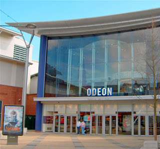
  Odeon is rather expensive when laid up against Vue’s general prices, yet I am led to believe that you get more for your money. Odeon boasts 14 screens, and reaches out to a wider audience by installing a bar for the more mature customers. Being at the riverside complex, it is a marginally farther distance to trek, but all the more rewarding when you arrive. Unlike Vue, Odeon sells food both separately and in bulk, as if to supply something resembling a meal instead of a child’s snack. Odeon’s higher rates for movies allow it to be more lenient with confectionary sales, making it all the more relaxing to visit for the seasoned movie-goer.
  Although I have not yet visited Cinema City, I understand it is set back from all other cinemas in the area. It is more of an independent cinematic experience, providing new or well-loved Indies and niche audience films to replace the sickeningly puerile family films showcased in the rival businesses. As well as feature films, Cinema City lets us use smaller screens to watch various art house shorts. Its main attraction is solely the films, with liquids only present in expensive alcoholic concoctions.
  To conclude, the three highlighted cinemas each aim to please a different audience. Vue is suited to the mainstream, ‘appropriate’ viewing and fancies of teenagers wishing to lazily drop into the closest screening possible. Odeon’s audience is ever so slightly more sophisticated, but still nothing but a commercially motivated business compared to the quirky independent shorts brought to us by Cinema City.

16/09/2010

Introduction/profile task

Name: Jack Sims

Hobbies: Reading, writing, watching TV, acting (occasionally), gaming

Media Interests:

  Print media:
I rarely buy or read newspapers, but occasionally pick up The Sun to laugh at the ridiculous stories. I tend to skim through and find something slightly insane to point out or criticise if it’s the only thing to read. I prefer accessing the news on the web, seeing as I can filter out all the sensationalist piffle and read stories which interest me in particular.
  I read several magazines in my line of interest. I buy Empire monthly to read about upcoming films and the happenings in the industry. Occasionally I buy the Official Nintendo Magazine for game reviews and queries. Music magazines tend to keep in the likes of Kerrang! or Metal Hammer for my niche of musical taste.
  Radio media:
I tend to listen to Kerrang! Radio or local stations for some news, as long as I can stand the endlessly repeating playlists of chart topping mediocre bands.
  Music Industry:
My preferences of genre stay in the wide scope of Rock and Metal; Occasionally General Rock, Punk, Grunge etc., but mostly Heavy Metal (Thrash, NWOBHM, Proto). I don’t belong to a band, as I have no grasp of any instrument apart from a dated Casio.
  I tend to access most of my music from the PC after compiling all of it onto iTunes. Illegally downloading music from sites is something we might have all done in the past, though I disapprove of bands not making any money with droves of fans torrenting tracks.
  The music industry definitely affects the way I dress and what I aspire to. The general style of Metal set down by bands such as Black Sabbath and Judas Priest is still popular among many. A lot of Metal is written in protest, like Sabbath’s War Pigs, conceived during the turmoil in Vietnam and elsewhere.
  Video Games:
I don’t particularly have a favourite video game, but most of my highest rated ones were released by either Nintendo or Valve. Sidescrollers like Super Mario Bros. were masterpieces back in the 80s, setting down the blueprint for almost every other similar format game in history.
  In terms of Valve, my favourites would be Half Life 2 and Left 4 Dead 2. HL2, much regarded by players and critics alike as the best game of all time, follows Gordon Freeman in a First-person Shooter in which he fights the totalitarian invading aliens, the Combine. Unlike other games of 2004 and beyond, all of the cutscenes were fully playable, and the Source Engine physics were incredibly accurate. Further episodes to the storyline were added in 2007, and we are currently waiting for the final instalment.
  L4D2 is the sequel to the controversial best-selling game of 2009, Left 4 Dead, and runs on an updated Source Engine. Up to 4 players slash, shoot and sprint their way through several multi-stage campaigns set in the American deep South to find safety in the zombie apocalypse; The graphic nature of the game and false allegations of racism lead to a thankfully unsuccessful boycott.
  The attitude that videogames are violent and offensive could be supported by L4D2, but looking closer it is much more rounded and correct. The concerns arose with parts of campaigns being flooded with bloated corpses in water, not long after hurricane Katrina. Some zombies were also black or Asian, which aggrovated this and led to a racism boycott. If all of the zombies were white, I think it would be far more racist, and a slection of various nationalities in zombies is actually reasonably PC. The graphic nature of the game is also expected in an FPS. Violent games have distinct age restrictions to stop this outrage happening, but small children may still be influenced badly by such games.
  New Technology:
New technology has allowed me to get the news as it happens, anywhere, which is a great advantage for everyone. Mobile phones have also allowed us to be more social and keep in contact halfway across the globe. Multimedia ways of watching films are a great way fore the industry to attract customers, and programs allowing you to broadcast your own media on the internet are available to all. The media has evolved, and in turn the consumers have.
  Television:
I watch channels as the programs come and go. I tend to switch channels if something interest is elsewhere. My favourite TV channels include the BBC, for its decent amount of drama and satirical comedy, and its overall left-wing undertones. As genres go, I would choose Comedy for the joy of laughter, especially at the state of the country, or Horror. I consider quite a few programs memorable, but the most recent one to stand out to me is the series on E numbers on the BBC. Contrary to popular belief, they do you an amount of good.
  Feature film:
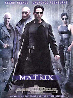
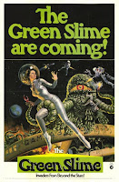
I like to watch films whenever I can. My favourite genres would be Comedy and Horror, or a mix of both like in schlock or horrifically low budget laughs. Three films I would describe as outstanding would be Vertigo, The Matrix and Green Slime.  The first was one of Hitchcock’s superb movies, relatively flawless in my opinion. The Matrix was, for lack of a better word, game-changing, and altered the way our generation thought. Green Slime was, even on 60s sci-fi B movie terms, a low budget atrocity. If you didn’t laugh, you’d cry. The Hendrix-esque end theme was mental.
  I consume films from television, cinema, the internet, anywhere that films could possibly be shown.  But the atmosphere of the big screen is the better than any other. I usually head down to Riverside Odeon, since Vue’s rubbish. I prefer watching films in a group. I have never contributed to anything in media other than the activities week road safety.
    I am not easily offended by texts, but those which have were awful. Some papers portray teens as 100% antisocial, which is a misleading stereotype in my opinion. Heavy Metal also gets bad press, seeing as for some bizarre reason people think we all worship Satan: they’re only a nutty sub-culture, made up by the clinically insane and the odd National Front News reader. Contrastingly I thought the work on artificial life was ground-breaking, and points toward a bright future for man rather than an act punishable by God and his lightning bolts.
  Reading about unsustainable Palm oil in Borneo has altered my way of consuming products, as I sometimes look for a source of Palm oil on the packaging. If I were to write a media text for the reading of the public, I would write about the idiotic stereotypes of Metalheads being Satanists. I chose media studies due to my interest in film and drama.